Illustration + Layout + Environment Design
The Problem: Polycystic Ovary Syndrome (PCOS) affects 1 in 10 womxn in the United States. Many womxn aren't aware of PCOS and can get misdiagnosed or not diagnosed at all. There is no cure and little research.
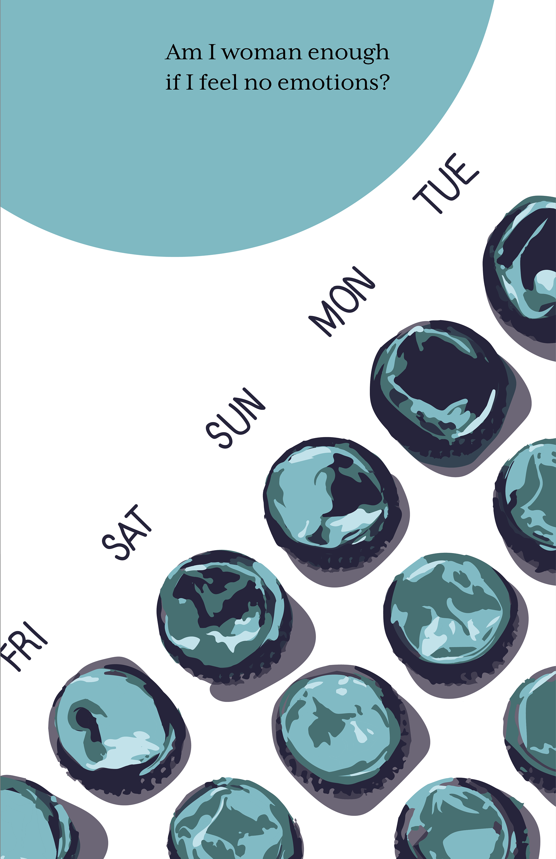
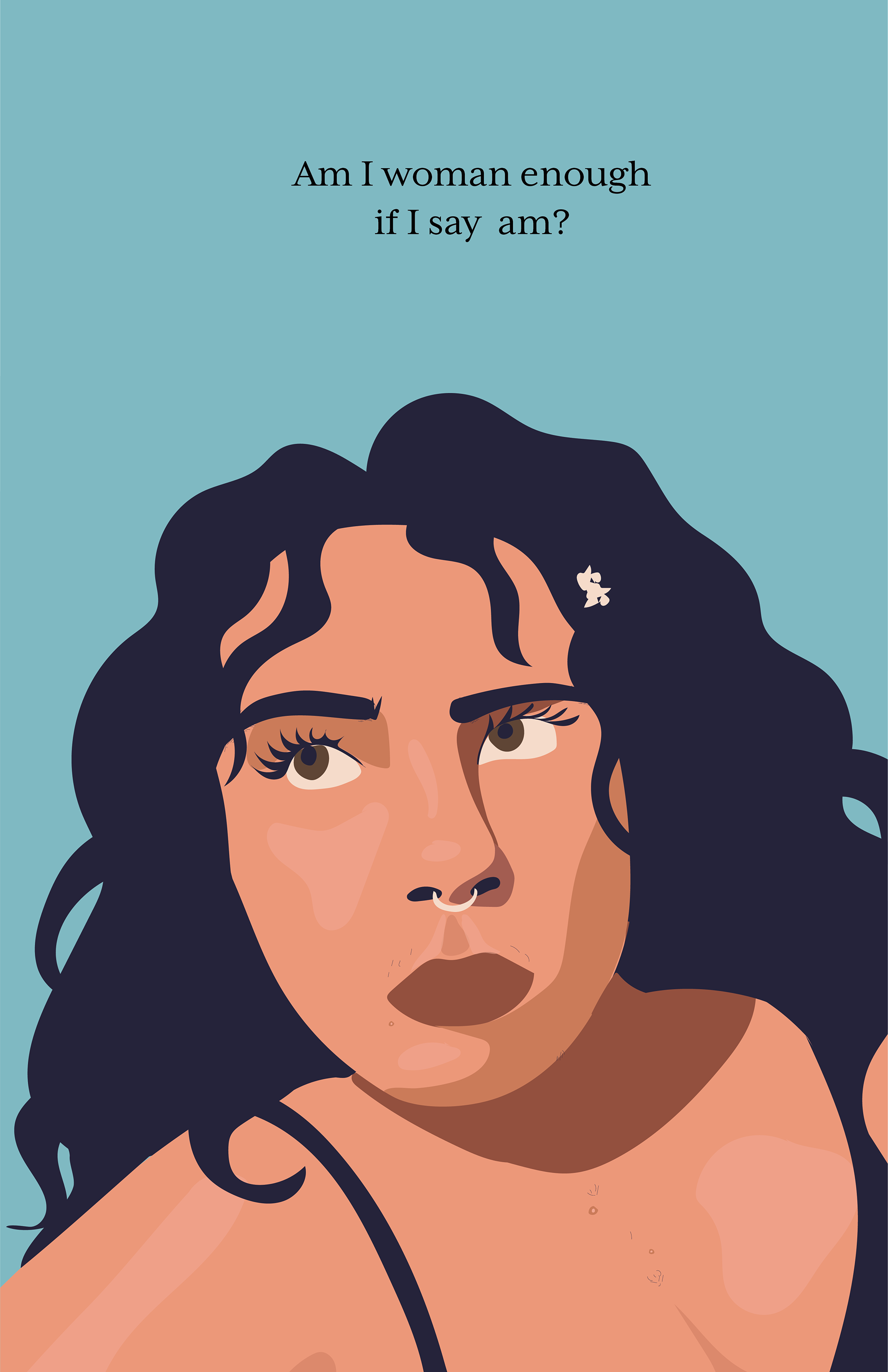
The Solution: As a mentee of the 2019 AIGA Orlando Mentorship Program, I developed a zine that documented my journey with Polycystic Ovary Syndrome (PCOS) with the goal to bring awareness to this syndrome.
The Solution: As a mentee of the 2019 AIGA Orlando Mentorship Program, I developed a zine that documented my journey with Polycystic Ovary Syndrome (PCOS) with the goal to bring awareness to this syndrome.
DISPLAY //
My goal through this project was to be as transparent and vulnerable as possible in the hopes of educating readers on one of the most common hormonal disorders in women.
My goal through this project was to be as transparent and vulnerable as possible in the hopes of educating readers on one of the most common hormonal disorders in women.
The display was created using furniture from my teenage bedroom and featured a mirror as the center piece to physically and literally perpetuate the theme of reflection.
Viewers were encouraged to open the drawers filled with a variety of empty medication bottles and packaging I've used to treat my PCOS. Very little is known about this disorder and there is no cure.
Viewers were encouraged to open the drawers filled with a variety of empty medication bottles and packaging I've used to treat my PCOS. Very little is known about this disorder and there is no cure.
MOTIFS //
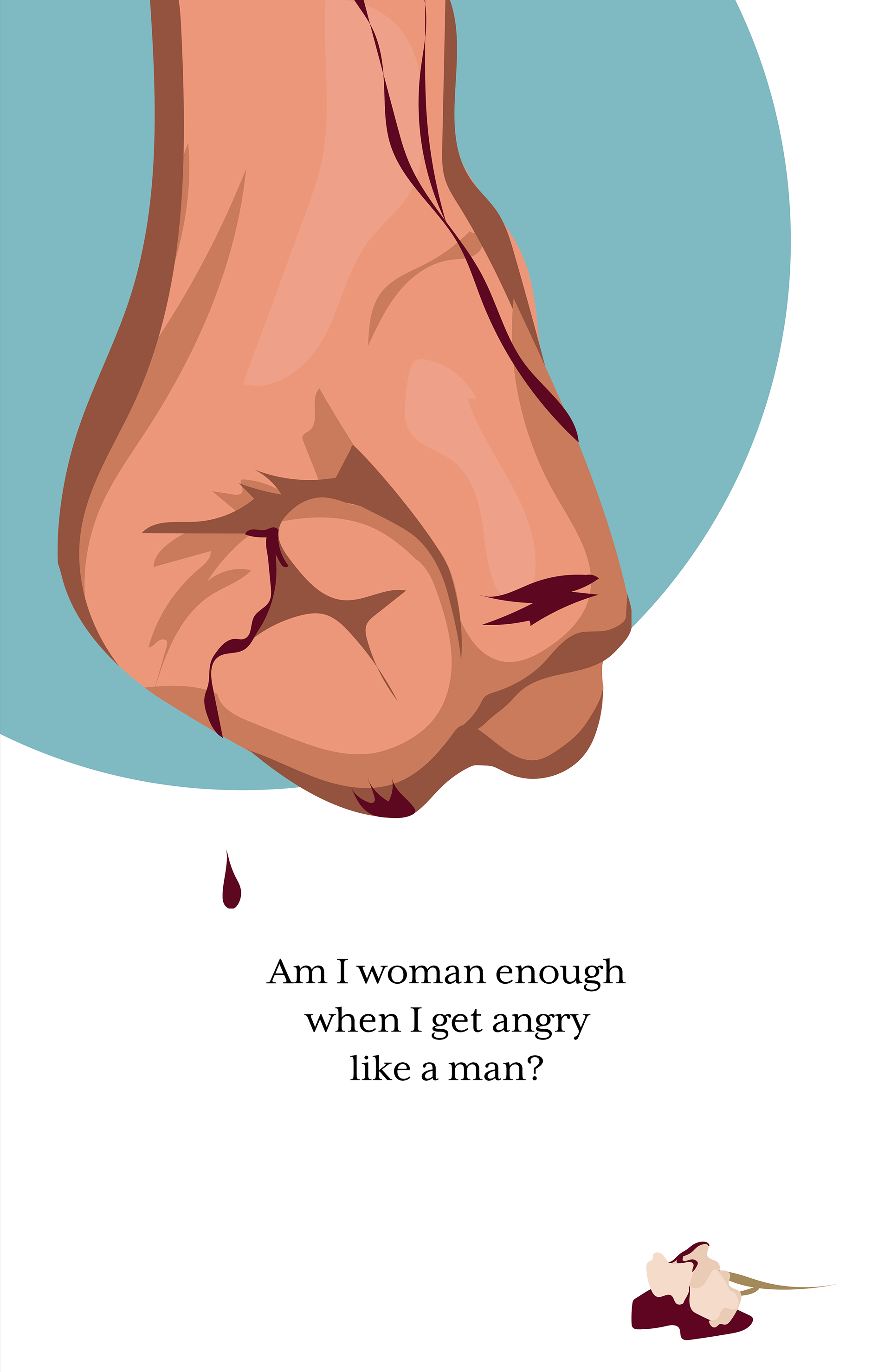
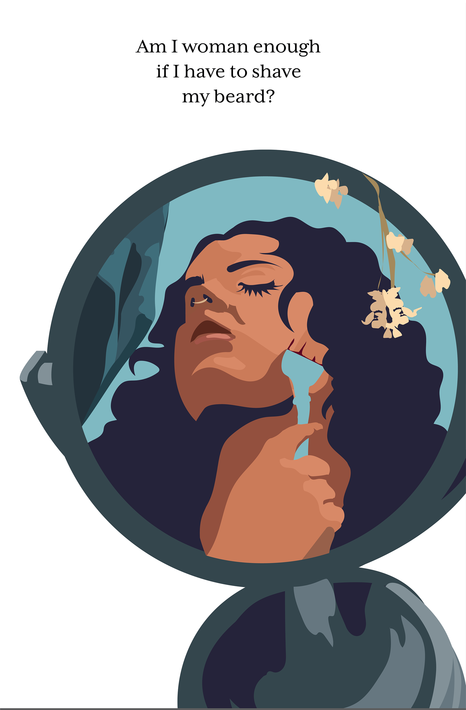
Two visual motifs within the zine are baby's breath flowers and blood. The two elements represent my struggle of being physically very masculine but feeling and presenting as feminine. They also carry a double meaning — PCOS is the leading cause of female infertility in America and often leads to miscarriage. While I have not personally experienced this, it's something I think about often and felt it should be present
within my work.
TYPEFACE //
within my work.
TYPEFACE //
The two typefaces used throughout this piece are Mr. Eaves (sans) and Mrs. Eaves (serif.)
These fonts were created by Zuzana Licko and were inspired by Baskerville. Baskerville has been "criticized for being too perfect, stark, and difficult to read." Licko wanted to create something and different new while keeping the "openness of Baskerville." Her rendition is known as "imperfect yet pleasing."
While I continue to struggle with my masculine and feminine side, attempting to find the proper balance, they both come together an "imperfect yet pleasing" way.
source: https://fonts.adobe.com/fonts/mrs-eaves#about-section


